Tuesday 17 April 2012
Wednesday 4 April 2012


Sunday 1 April 2012
Q4- Evaluation:
How did you use media technologies in the construction and research, planning and evaluation stages?
In order to display the whole of my coursework and all of the stages it had gone through I created a blog on blogger.com. In this respect the internet was really helpful as it allowed me to visually present my coursework in a different way for example through video posts or by creating Prezi’s. It was also really effective in chronologically charting the growth of my coursework and each stage I had to get through to create my final products. I was able to directly utilise tools on blogger such as labels in order to make sure my blog was organised and structured while I was able to use other aspects of the site such as its polling tool to help in understanding my audience through asking them questions about my products, an understanding of the audience being a vital aspect of my coursework.
In terms of the research and planning stages of creating my coursework I found the internet was particularly helpful in allowing me to quickly and easily access existing products. For a lot of my similar product research I relied on websites such as Youtube which let me view music video’s online, through this website I was able to deconstruct the components of the video and visually break these down by posting them on my blog in either screen shots or embedding the whole video. I followed a similar process when creating both of my ancillary tasks. I used the internet as a starting base to research design ideas and specifically pick out those that I felt were successful and the components which made them successful. Through the internet I was able to access such a wide variety of both music videos and ancillary products which gave me a clear idea of the general features of these products amongst their genre as well as giving me good ideas about the kind of product I wanted to make, it was with these ideas I created the inspiration page on my blog. Media technologies were also really important in my research stage in terms of giving me a feel of the kind of software I would be using when creating my music video. As part of my research I went out and experimented with the Sony HVR cameras and took some shots. Because this was the first time I had ever used the cameras it helped me in experimenting with some shot types and understanding how to use the camera for example changing its focus or zooming in and out. I then uploaded some of the sequences into Adobe Premiere Pro and experimented with using various effects on these sequences such as reverse, colour pass and distort. This was helpful in allowing me to gain a feel for the software and the kind of effects I could use when creating my music video. Another aspect of my planning that I found really helpful and required the use of media technologies was the creation of my animatic. My animatic was a sequence of draft storyboards I created accompanied by my chosen song. This was really useful because not only did it make me think of the kind of shots I wanted to create in my video but it allowed me to visually see these and evaluate at this stage whether they worked effectively. It was this part of my coursework which helped me in creating my running order, a basic outline of the kind of shots I wanted to take when filming my music video.
In the actual construction stage of my coursework I used two different types of camera’s to film my music video. For my location shoots I used a Canon 550D camera as well as a steadicam to make sure my shots weren’t too shaky. This camera was really effective as it allowed me to capture some really interesting HD footage in terms of lighting while I was also able to play around with the focus of the camera in order to make my location shoots a bit more interesting. The steadicam was also really important when doing my location shoots as it gave me a lot of flexibility while filming which meant I could take a variety of different shots for example I followed the main actresses feet as she walked during one of them. The majority of my video was made up of green screen footage and therefore I used a better camera for this in order to ensure the footage was as good quality as possible. I also used a tripod while filming these shots and though it gave me less flexibility than the steadicam I was able to compensate through my camera movement in the location shoots and I made sure I included a lot of different shot types such as close ups in order to make my music video visually interesting. After shooting I imported all of my sequences in the professional programme Adobe Premiere Pro where I cut them up and placed them in the specific order I wanted. I also used this programme to give my music video cool effects on sequences for example in one shot I reversed its order so it appeared like the person was sucking in the bubbles rather than blowing them out. After exporting all of my footage I imported it into Adobe after effects. This was necessary because I had to get rid of the green background as part of green screening my footage, initially I wanted to replace this with a plain white background however I decided to embrace the positive and fun themes within my video and add a cartoon like effect on this footage. Firstly in order to remove the green screen I had to divide each section of my footage up into individual layers and then drag a user preset onto all of these to remove the green background. However I had to go through and tweak each individual layer to make sure it had green screened properly and adjust them by using the screen matte tool. After completing this I decided to add the cartoon like effect on my video, I achieved this through adding two new layers on each of sequence of the footage and dragging two user presets onto these layers called black and white. This made it appear as if the people participating within my video had black and white outlines and therefore appear to be in cartoon form. I extenuated this effect by adding a drop shadow to each sequence of the footage. I also changed the colour layer of every sequence, using a range of different colours such as reds, pinks and blues as the background for my video and this was not only effective in making my video more visually interesting but coincided with its positive themes.
In terms of the construction stages of my ancillary tasks I used a professional camera and lighting to take various images of the artist. After taking a range of these photo’s I imported them into adobe Photoshop in order to create my products. I found this programme really effective because not only did it allow me to experiment with various features such as changing the images saturation and filter and adding effects to text such as drop shadows but also through the eye tool I was able to hide these layers and therefore see whether I wanted to include these effects or not. Photoshop was also really important in creating the puzzle piece design I consistently used among all of my ancillary tasks. I created this by importing a texture into photoshop and then dropping down the opacity of the texture to make the image behind it stand out more. For the majority of my tasks I also experimented with lighting levels for example for my first album cover I created a filter effect on the main image which made the artist appear much darker and as if he had been ‘smudged’. These effects were really important in making my overall design stand out, this being vital in terms of attracting audiences.
In terms of my evaluation I used the same programme, Adobe Premiere, I had used when creating my music video. I found this programme particularly useful because not only did it allow me to make my evaluation more visually interesting but I was able to directly support the content of the evaluation with images on the screen for example I included before and after pictures of my album covers as well as Cam studio’s which charted the creation processes of my products. In this way it allowed me to visually chart the growth of my product and support everything I had included in my evaluation.
Saturday 31 March 2012
Q3 (Evalaution):
What have you learned from your audience feedback?
In terms of the demographics of my primary target audience they are predominantly aged between 15-25 and mainly consist of females. Additionally the majority of them will range between students and first time workers thus are often from lower social classes such as D and E. Though my primary audience will be female my secondary audience will consist of males aged between 15-25. In terms of psychographics my target audience could be best described as aspirers or ‘realists’. Because the vast proportion of my primary audience are young and therefore have their whole life ahead of them many could be identified as aspirers, however unlike the TA of r and b music videos my TA will aspire less for vast material, wealth and the kind of life connected to this (this being utilized and played upon in the majority of and r and b videos) but may instead aspire for popularity and friendships (specifically the younger part of the TA) or successful relationships, something I’ve directly taken on board where I’ve communicated these concepts to my audience through sign use. While some of my audience can be identified as aspirers others can be seen as ‘realists’ where they are much more down to earth and grounded than for example the TA of a stereotypical hip hop music video and therefore it was vital as an audience they connected to artist rather than aspiring to be him.
In order for any product to be successful it’s critical a complete understanding of the target audience is gauged at each stage in it’s production, by identifying and understanding a target audience it overall allows for a suitable product to be created which is as successful and appealing as possible in terms of meeting their requirements. Throughout all stages of my pre-production gauging an understanding of my audience was vital in terms of considering both their likes and dislikes and their overall demographics as well as how they ‘used’ products in the real world and identified with them as part of the uses and gratifications theory, by understanding this it allowed me to develop a product which was shaped around their needs and specific purposes as well as lived up to their expectations. For example I reinforced themes of love and romance throughout my video in order to appeal to predominant female portion of my TA while through costume use and using ordinary people to feature within my video I managed to connect to my audience, the main theme of the song itself in terms of a celebration of simple things such as love can be seen as doing this too.
I got feedback throughout my production stages for example after drafting my designs. I made sure that I asked people that were previous fans of the genre and fitted in with the demographics of my target audience and therefore would be interested in using and engaging with my product in the real world. Because the predominant part of my primary target audience would be female a lot of the feedback I gained was of females however I made sure I did ask some males too in order to ensure I didn’t neglect my secondary audience. I asked people from within my media class to give me feedback as they could help me with improving the technical aspects of my music video and ancillary tasks however I made sure I also asked people outside of my class as it gave me a fresh perspective on my products and also widened the amount of people I was gaining feedback of, ensuring they were not all from the same place.
In terms of actually gaining the feedback I handed out forms which were specific to the product I wanted to be looked at. These were really useful in allowing me to pin-point exact changes I needed to make to improve the product. I also created polls on my blog which enabled me to understand important information about my target audience which would affect their consumption of the product for example where they usually watch videos and what on the whole they consider to be the most important/entertaining aspect of a video and how they interact with the music industry in terms of where they get their music from. I think creating polls on my blog was really effective in that it was much easier for audiences to click a button then filling in a sheet. I filmed a lot of the feedback I gained and in some of the video’s I created I prepared questions to ask my audience, questions such as whether they felt following a narrative in a music video was important or if the use of a green screen was effective. By asking my audience questions it gave me the opportunity to understand precise details about the audience and things I was personally unsure about like whether not completely using location shoots would appeal to them.
My audience feedback forms were really important in the drafting process of some of my products such as in my digipack designs. I found this feedback particularly helpful because it helped me to see where I had gone wrong on my initial designs and subsequently how I could improve on my final ones as well as allowing me to understand aspects of my drafts they liked so far, aspects I could work on and improve furthermore. After creating my draft designs I asked 5 people to give me feedback on their improvements. The most useful feedback I got was in changing the font I had used on my album covers as this wasn’t particularly eye catching, this being a necessary component in any album cover. After gaining this feedback I changed my text to a bolder, more eye catching one which was bright red as well as putting effects on it like a drop shadow to make it stand out further. Other feedback I got was that I need to include something more on my first digipack because there was a lot of white space and it looked quite plain and therefore I changed the design by making the image of the artist take up more space as well as making the text larger and including an additional puzzle piece beside the profile shot of the artist. I also put a filter effect on the image which made it appear darker and as if it had been smudged. This overall made the album cover more quirky and unique; something my TA had picked on my polls as making a digipack successful.
Q2 (Evaluation):
How effective is the combination of your main product and ancillary texts?
The primary role of a music video is in advertising where it markets both a song and artist for the purpose of exposure as well as expansion of the artist’s profile. It also offers the chance for a song to be presented in visual form and this links to the theorist Andrew Goodwin and his ideas that the content of a music video relate to aspects of the song such as the lyrics. For some genre’s such as R and B a music video allows an artist to demonstrate other talents excluding singing such as dancing. However overall a music video’s main purpose is in advertising and invoking a reaction from the audiences, causing both the song and artist to be remembered.
Andrew Goodwin specifically stated that music video’s demonstrate key characteristics of their genre such as performance in an Indie pop music video. In order to exceed the audience’s expectations I went with these characteristics and followed the performance aspect of this genre and therefore in this way I fulfilled the purpose of a video in terms of its generic conventions. I personally feel that the predominant role of a music video is in displaying a song in its visual form and therefore it’s crucial the video remains entertaining for its audiences. I ensured this through my use of fast cuts and editing which kept with the pace of the song and made sure the audience’s attention was not diverted at any point. Additionally the positive themes I utilised in my video can be seen through the uses and gratifications theory as providing audiences with escapism. Escapism is a major aspect of this theory where audiences use such media texts as a means of entertainment, by reinforcing these fun and positive themes it made sure my target audience could use my product as a means of escapism, specifically because its overall narrative wasn’t complex or deep meaning it requires little thought process. Therefore in this way my music video served one of its primary purposes, entertaining the audience through its visual form of the song.
Additionally key aspects of my video such as my use of ordinary individuals to perform parts of the song would have appealed to my target audiences in terms of both personal identity and relationships. I purposefully chose people of a similar age range to my audience to feature in my video and through my sign use I communicated to them with issues which were directly applicable to specific aspects of their lives i.e. relationships. Therefore this would help my audience in feelings of personal identity where they may have been able to relate to the people featured in my video, finding reinforcement in their own values depicted by the signs. This is further strengthened by my use of casual clothing, by using such costumes it created an overall message for my audience to decode in terms of Stuart Hall’s encoding model where they were able to view those featured in my video as down to earth and therefore connect to the artist more, specifically as my target audience can be described more as realists than for example aspirers. Therefore by actively creating a product my audiences would use as for entertainment and as part of the uses and gratifications theory it ensured it fulfilled its role as an effective product.
In terms of advertising I personally feel that by not including the main artist in my music video it helped in creating some sort of mystery and ambiguity surrounding him. This may have directly caused potential audiences to further research into the artist and his former songs and therefore by not including the main artist in my video I think it worked in promoting all of the artists work rather than just the one song. I also think my music video served it’s purposing in terms of advertising due to the fact it stuck to its basic generic conventions, sustaining the audiences expectations of this type of video as well as being overall entertaining.
The purpose of a digipack as a whole is in selling the album to the audience as well as including important information about the artist and album. The front album cover primarily acts in advertising both the artist and album and therefore it’s crucial it stands out to attention in order to attract potential audiences. The back cover whereas is important in informing the audience about what songs are included in the album, rather than in selling it, while the middle digipack’s are primarily used as a form of design, in demonstrating the artists personality and the style of music featured in their album or they can be used as a means of saying thank you to producers etc. I believe every part of album cover served their purpose in this respect where for my first digipack design I included bold, brightly coloured fonts as well as a striking puzzle piece effect design which attracted attention to important details on the cover, details such as the artist and album name which were important in terms of advertisement. For my two middle album covers I developed a unique design portraying the personality of my artist and his style in terms of his music. For my second album cover I picked out a main image I felt particularly stood out, specifically reinforcing part of the artists performance and then decided to make it appear as if the artist was singing however instead of featuring musical notes coming from his mouth I used puzzle pieces, this was a unique idea which allowed me to express the artists overall personality. For my third cover I created a design consisting of collage of puzzle pieces with images of the artist in them. I think in this way both of my middle digipacks designs served their purpose as almost creative ‘memorabilia’ of the artist, they were specifically unique to both him and the album and his overall style of music. In terms of my back album cover because it’s primary purpose is in informing the audience I made sure I used clear fonts and numbers. I also followed the puzzle piece scheme I had adopted throughout all of my ancillary tasks. Keeping a house style across all of these products with this puzzle piece effect was very important in terms of both consistency and making these products personal to my artist. The puzzle pieces not only interlinked with the album name but created a unifying theme amongst all of my designs which linked all of my products together.
In terms of my magazine advert its main role is in advertising the album and the artist on the whole. In order to advertise a product effectively it had to be eye catching and dominating, I achieved this through the use of bold fonts and adopting the red and black colour scheme I had in my previous designs. I also included an ambiguous image of the artist, this was particularly important in serving the adverts’ purpose in giving away basic details about the artists release date however overly not giving away too much, causing potential audiences to want to research further into the artist/ album. I also used the puzzle piece design I had on my digipack covers in order to adopt a house style across all my products, once again giving my product consistency as well as a individual ‘signature’ that the user would associate with this product. This was reinforced by my black and red colour scheme which I also used through all designs.
Q1 (Evaluation):
In what ways does your media product use, develop or challenge forms and conventions of real media products?
For the main production task of my music video I created a video to the song Simply wonderful by Tim Myers, this is an example of a stereotypical song from the indie pop genre. The predominant purpose of a music video is in advertising, its markets both a song and artist for the purpose of exposure as well as expansion of their profile. In terms of the conventions of the Indie pop genre these stereotypically utilize themes of happiness and love, directly mirroring such through prop use, as well as focusing on some aspects of performance such as miming. Conventionally they follow simplistic story lines however may include some more complex or different ways of communicating such a narrative i.e. through using humour, this separates itself from a generic pop music video and thus as part of the sub indie genre. I thought it was important in order to access a wider range of audience to directly utilise and develop these different forms and conventions rather than challenge them. In order to fully understand these I textually analysed some music videos and picked out the specific components which make them typical of their genre, as well as this I focused on key music theories like Andrew Goodwin’s in order to fully understand the characteristics of music videos on the whole such as how there is a relationship between visuals of the music video and the lyrics. I directly incorporated such knowledge into my own video and this can be supported by the fact I’ve included signs which state what each person featured in my video finds simply wonderful timed exactly with the chorus of the song. In terms of mise-en-scene my use of props directly coincided with the typically used positive themes amongst this genre where I used balloons and party poppers in my video. This also added a carefree element to the video, reminding the audiences to celebrate life’s simple pleasures. Additionally the positive themes present in my video relate back to the uses and gratifications theory in terms of escapism where it could provide the audience with a release from everyday life, specifically as the bulk of my target audience are between 15-27 and therefore may be in education.
I also decided to add a different element to my video by using signs to communicate with my audience, these signs were held up by the people participating in my video and state what they find simply wonderful. In order to keep my video applicable and relevant to my audiences I purposefully used issues on these signs such as relationships and friends, as part of the uses and gratifications theory my audience would be directly able to identify with this. Thus such iconography was key in creating the overall look and feel I wanted for my video as well in developing and going with the stereotypical conventions of this genre. By developing these conventions rather than challenging them it meant my overall video was more suited to my audiences in terms of its genre, genre being a significant factor in audience’s expectations of a music video and if I had challenged these too much it would have potentially decreased my target audience base.
In order to keep with this ‘positive’ theme the representation of the people participating in my video was key, going against the male gaze theory I displayed women progressively while my use of costumes in terms of colour added to the positive ‘feel’ of my video. The main message of my music video is a celebration of life and aspects of the world people find simply wonderful, by using bright colours such as yellows and pinks it enforced the youth in my video as well as how life shouldn’t be taken too seriously in terms of celebration and happiness. My camera movement and editing also reinforced this positive theme where I used fast cuts and several close up shots of people smiling and laughing to enforce their happiness. The use of fast cuts was also important in going with the tempo of the song and I made sure the editing was timed correctly with its pace.
In terms of both my digipack and magazine advert I followed a similar process that I did for my music video, specifically in terms of my album covers I researched the components which make a successful album pack. I looked at a variety of designs, belonging to a range of different genres and picked out those that I found successful and specifically what made them successful. I found that among the indie-pop genre typically more creative designs were used rather than just an image of the artists as for example in album covers belonging to the R and B genre. In order to gain a further understanding of my audience wants as well as their overall expectations of a digipack for this genre I created a poll on my blog, specifically asking the target audience which designs they felt worked most effectively and the majority answered that they preferred the use an unusual/ quirky design . Therefore directly based on my audiences wants I decided to come up with a creative design which interlinked with the albums name ‘missing piece’, by linking the album name with the overall design it gave my digipack some form of consistency which is important in creating a product more personal for target audiences. For my first cover I used a sideward image of the artist and combined this with a faded puzzle piece effect imposed over the top, because part of the role of the first cover is in advertisement and my product would be competing with thousands of others amongst the genre I made sure I used bold, loud fonts and colours such as reds and blacks, these not only stood out to audiences but through semiotics symbolically connoted dominance and supremacy. Even though I wanted to create a memorable design for my audiences it was important I didn’t only focus on the puzzle piece design itself and make sure the image stood out to attention too. That is why I decided to put a filter effect on the image and faded the puzzle pieces even more on my second draft. I kept this puzzle piece design across all of my products, by using the same design it allowed me to create an overall house style which made my product distinctive to its audiences. Therefore I utilised key conventions of this genre when creating all of my album covers however I developed these to directly link in with the artist and his own album.
The primary role of a magazine advert is in advertising both the artist and the album they are selling yet not giving too much away at the same time. Through my previous similar product research I found the key conventions of any music advert are the use of bold, dominating fonts which inform the reader basic details about the artist and album such as its release date as well as the use of a striking image. This overall makes the advert stand out to attention and therefore intrigues audiences to further research into the album and/ or artist. Specifically to my genre of Indie pop these type of magazine adverts offer the opportunity to provide a partial insight into the artists ‘personality’ and their individual ‘style’ of music. Their overall design is often more unique to both the album and artist than for example a generic r and b type magazine advert. I based my own advert on these conventions where I included a unique design which linked with the puzzle piece scheme I had created in my album covers, this was important in making my advert stand out as well as making it almost ambiguous, causing potential audiences to want to research into the album and artist. Additionally I kept a consistent house style across all of my ancillary products which allowed me to make my advert more personal to the artist and create an individual style related to all of my products.
Q4- Evaluation:
How did you use media technologies in the construction and research, planning and evaluation stages?
In order to display the whole of my coursework and all of the stages it had gone through I created a blog on blogger.com. In this respect the internet was really helpful as it allowed me to visually present my coursework in a different way for example through video posts or by creating Prezi’s. It was also really effective in chronologically charting the growth of my coursework and each stage I had to get through to create my final products. I was able to directly utilise tools on blogger such as labels in order to make sure my blog was organised and structured while I was able to use other aspects of the site such as its polling tool to help in understanding my audience through asking them questions about my products, an understanding of the audience being a vital aspect of my coursework.
In terms of the research and planning stages of creating my coursework I found the internet was particularly helpful in allowing me to quickly and easily access existing products. For a lot of my similar product research I relied on websites such as Youtube which let me view music video’s online, through this website I was able to deconstruct the components of the video and visually break these down by posting them on my blog in either screen shots or embedding the whole video. I followed a similar process when creating both of my ancillary tasks. I used the internet as a starting base to research design ideas and specifically pick out those that I felt were successful and the components which made them successful. Through the internet I was able to access such a wide variety of both music videos and ancillary products which gave me a clear idea of the general features of these products amongst their genre as well as giving me good ideas about the kind of product I wanted to make, it was with these ideas I created the inspiration page on my blog. Media technologies were also really important in my research stage in terms of giving me a feel of the kind of software I would be using when creating my music video. As part of my research I went out and experimented with the Sony HVR cameras and took some shots. Because this was the first time I had ever used the cameras it helped me in experimenting with some shot types and understanding how to use the camera for example changing its focus or zooming in and out. I then uploaded some of the sequences into Adobe Premiere Pro and experimented with using various effects on these sequences such as reverse, colour pass and distort. This was helpful in allowing me to gain a feel for the software and the kind of effects I could use when creating my music video. Another aspect of my planning that I found really helpful and required the use of media technologies was the creation of my animatic. My animatic was a sequence of draft storyboards I created accompanied by my chosen song. This was really useful because not only did it make me think of the kind of shots I wanted to create in my video but it allowed me to visually see these and evaluate at this stage whether they worked effectively. It was this part of my coursework which helped me in creating my running order, a basic outline of the kind of shots I wanted to take when filming my music video.
In the actual construction stage of my coursework I used two different types of camera’s to film my music video. For my location shoots I used a Canon 550D camera as well as a steadicam to make sure my shots weren’t too shaky. This camera was really effective as it allowed me to capture some really interesting HD footage in terms of lighting while I was also able to play around with the focus of the camera in order to make my location shoots a bit more interesting. The steadicam was also really important when doing my location shoots as it gave me a lot of flexibility while filming which meant I could take a variety of different shots for example I followed the main actresses feet as she walked during one of them. The majority of my video was made up of green screen footage and therefore I used a better camera for this in order to ensure the footage was as good quality as possible. I also used a tripod while filming these shots and though it gave me less flexibility than the steadicam I was able to compensate through my camera movement in the location shoots and I made sure I included a lot of different shot types such as close ups in order to make my music video visually interesting. After shooting I imported all of my sequences in the professional programme Adobe Premiere Pro where I cut them up and placed them in the specific order I wanted. I also used this programme to give my music video cool effects on sequences for example in one shot I reversed its order so it appeared like the person was sucking in the bubbles rather than blowing them out. After exporting all of my footage I imported it into Adobe after effects. This was necessary because I had to get rid of the green background as part of green screening my footage, initially I wanted to replace this with a plain white background however I decided to embrace the positive and fun themes within my video and add a cartoon like effect on this footage. Firstly in order to remove the green screen I had to divide each section of my footage up into individual layers and then drag a user preset onto all of these to remove the green background. However I had to go through and tweak each individual layer to make sure it had green screened properly and adjust them by using the screen matte tool. After completing this I decided to add the cartoon like effect on my video, I achieved this through adding two new layers on each of sequence of the footage and dragging two user presets onto these layers called black and white. This made it appear as if the people participating within my video had black and white outlines and therefore appear to be in cartoon form. I extenuated this effect by adding a drop shadow to each sequence of the footage. I also changed the colour layer of every sequence, using a range of different colours such as reds, pinks and blues as the background for my video and this was not only effective in making my video more visually interesting but coincided with its positive themes.
In terms of the construction stages of my ancillary tasks I used a professional camera and lighting to take various images of the artist. After taking a range of these photo’s I imported them into adobe Photoshop in order to create my products. I found this programme really effective because not only did it allow me to experiment with various features such as changing the images saturation and filter and adding effects to text such as drop shadows but also through the eye tool I was able to hide these layers and therefore see whether I wanted to include these effects or not. Photoshop was also really important in creating the puzzle piece design I consistently used among all of my ancillary tasks. I created this by importing a texture into photoshop and then dropping down the opacity of the texture to make the image behind it stand out more. For the majority of my tasks I also experimented with lighting levels for example for my first album cover I created a filter effect on the main image which made the artist appear much darker and as if he had been ‘smudged’. These effects were really important in making my overall design stand out, this being vital in terms of attracting audiences.
In terms of my evaluation I used the same programme, Adobe Premiere, I had used when creating my music video. I found this programme particularly useful because not only did it allow me to make my evaluation more visually interesting but I was able to directly support the content of the evaluation with images on the screen for example I included before and after pictures of my album covers as well as Cam studio’s which charted the creation processes of my products. In this way it allowed me to visually chart the growth of my product and support everything I had included in my evaluation.
In order to display the whole of my coursework and all of the stages it had gone through I created a blog on blogger.com. In this respect the internet was really helpful as it allowed me to visually present my coursework in a different way for example through video posts or by creating Prezi’s. It was also really effective in chronologically charting the growth of my coursework and each stage I had to get through to create my final products. I was able to directly utilise tools on blogger such as labels in order to make sure my blog was organised and structured while I was able to use other aspects of the site such as its polling tool to help in understanding my audience through asking them questions about my products, an understanding of the audience being a vital aspect of my coursework.
In terms of the research and planning stages of creating my coursework I found the internet was particularly helpful in allowing me to quickly and easily access existing products. For a lot of my similar product research I relied on websites such as Youtube which let me view music video’s online, through this website I was able to deconstruct the components of the video and visually break these down by posting them on my blog in either screen shots or embedding the whole video. I followed a similar process when creating both of my ancillary tasks. I used the internet as a starting base to research design ideas and specifically pick out those that I felt were successful and the components which made them successful. Through the internet I was able to access such a wide variety of both music videos and ancillary products which gave me a clear idea of the general features of these products amongst their genre as well as giving me good ideas about the kind of product I wanted to make, it was with these ideas I created the inspiration page on my blog. Media technologies were also really important in my research stage in terms of giving me a feel of the kind of software I would be using when creating my music video. As part of my research I went out and experimented with the Sony HVR cameras and took some shots. Because this was the first time I had ever used the cameras it helped me in experimenting with some shot types and understanding how to use the camera for example changing its focus or zooming in and out. I then uploaded some of the sequences into Adobe Premiere Pro and experimented with using various effects on these sequences such as reverse, colour pass and distort. This was helpful in allowing me to gain a feel for the software and the kind of effects I could use when creating my music video. Another aspect of my planning that I found really helpful and required the use of media technologies was the creation of my animatic. My animatic was a sequence of draft storyboards I created accompanied by my chosen song. This was really useful because not only did it make me think of the kind of shots I wanted to create in my video but it allowed me to visually see these and evaluate at this stage whether they worked effectively. It was this part of my coursework which helped me in creating my running order, a basic outline of the kind of shots I wanted to take when filming my music video.
In the actual construction stage of my coursework I used two different types of camera’s to film my music video. For my location shoots I used a Canon 550D camera as well as a steadicam to make sure my shots weren’t too shaky. This camera was really effective as it allowed me to capture some really interesting HD footage in terms of lighting while I was also able to play around with the focus of the camera in order to make my location shoots a bit more interesting. The steadicam was also really important when doing my location shoots as it gave me a lot of flexibility while filming which meant I could take a variety of different shots for example I followed the main actresses feet as she walked during one of them. The majority of my video was made up of green screen footage and therefore I used a better camera for this in order to ensure the footage was as good quality as possible. I also used a tripod while filming these shots and though it gave me less flexibility than the steadicam I was able to compensate through my camera movement in the location shoots and I made sure I included a lot of different shot types such as close ups in order to make my music video visually interesting. After shooting I imported all of my sequences in the professional programme Adobe Premiere Pro where I cut them up and placed them in the specific order I wanted. I also used this programme to give my music video cool effects on sequences for example in one shot I reversed its order so it appeared like the person was sucking in the bubbles rather than blowing them out. After exporting all of my footage I imported it into Adobe after effects. This was necessary because I had to get rid of the green background as part of green screening my footage, initially I wanted to replace this with a plain white background however I decided to embrace the positive and fun themes within my video and add a cartoon like effect on this footage. Firstly in order to remove the green screen I had to divide each section of my footage up into individual layers and then drag a user preset onto all of these to remove the green background. However I had to go through and tweak each individual layer to make sure it had green screened properly and adjust them by using the screen matte tool. After completing this I decided to add the cartoon like effect on my video, I achieved this through adding two new layers on each of sequence of the footage and dragging two user presets onto these layers called black and white. This made it appear as if the people participating within my video had black and white outlines and therefore appear to be in cartoon form. I extenuated this effect by adding a drop shadow to each sequence of the footage. I also changed the colour layer of every sequence, using a range of different colours such as reds, pinks and blues as the background for my video and this was not only effective in making my video more visually interesting but coincided with its positive themes.
In terms of the construction stages of my ancillary tasks I used a professional camera and lighting to take various images of the artist. After taking a range of these photo’s I imported them into adobe Photoshop in order to create my products. I found this programme really effective because not only did it allow me to experiment with various features such as changing the images saturation and filter and adding effects to text such as drop shadows but also through the eye tool I was able to hide these layers and therefore see whether I wanted to include these effects or not. Photoshop was also really important in creating the puzzle piece design I consistently used among all of my ancillary tasks. I created this by importing a texture into photoshop and then dropping down the opacity of the texture to make the image behind it stand out more. For the majority of my tasks I also experimented with lighting levels for example for my first album cover I created a filter effect on the main image which made the artist appear much darker and as if he had been ‘smudged’. These effects were really important in making my overall design stand out, this being vital in terms of attracting audiences.
In terms of my evaluation I used the same programme, Adobe Premiere, I had used when creating my music video. I found this programme particularly useful because not only did it allow me to make my evaluation more visually interesting but I was able to directly support the content of the evaluation with images on the screen for example I included before and after pictures of my album covers as well as Cam studio’s which charted the creation processes of my products. In this way it allowed me to visually chart the growth of my product and support everything I had included in my evaluation.
Tuesday 20 March 2012
Thursday 15 March 2012
Friday 9 March 2012
Friday 2 March 2012
Sunday 26 February 2012
Magazine advert Feedback:
This is the feedback I gained regarding the final drafts of my magazine advert. This was a really important because in order for my magazine advert to be effective it had to stand out to audiences and therefore I needed to assess whether it did this and if it didn’t how I could improve it so it did:
Tuesday 21 February 2012
Production Diary-
This week I conducted my location shoots. I used primary two locations: my garden and the local woods. In terms of the pre- production I didn’t create a running order because I had in mind what kind of shots I wanted and the whole purpose of my location shoots was to experiment with these ideas, specifically as I already have the majority of my footage. I also didn’t need to get my actress to sign a release form because she had featured in my previous video and I had already signed one.
In terms of the actual footage I conducted it at two separate times during the day so I could get the lighting right. I used a steadicam which gave me a lot of flexibility while filming which meant I could take a variety of different shots in terms of camera movement and shot type. In order to fit in with the overall theme of the music video I wanted to film her doing simplistic things such as picking flower petals, simple pleasures which link back to theme of simply wonderful. In the next couple of weeks I’m going to focus on incorporating these into my own music video as well as starting to focus on writing my evaluation. This week I also got audience feedback of Lily Da Costa, someone who would make up part of my target audience in the real world. I asked her to give me feedback on my final digipack designs in order to see if there were aspects she thought needed changing. This was particularly useful because she highlighted how the text used on the back cover doesn’t stand out enough like the others text used, something I’ve already been considering and therefore I’m defiantly going to improve this design.
In terms of the actual footage I conducted it at two separate times during the day so I could get the lighting right. I used a steadicam which gave me a lot of flexibility while filming which meant I could take a variety of different shots in terms of camera movement and shot type. In order to fit in with the overall theme of the music video I wanted to film her doing simplistic things such as picking flower petals, simple pleasures which link back to theme of simply wonderful. In the next couple of weeks I’m going to focus on incorporating these into my own music video as well as starting to focus on writing my evaluation. This week I also got audience feedback of Lily Da Costa, someone who would make up part of my target audience in the real world. I asked her to give me feedback on my final digipack designs in order to see if there were aspects she thought needed changing. This was particularly useful because she highlighted how the text used on the back cover doesn’t stand out enough like the others text used, something I’ve already been considering and therefore I’m defiantly going to improve this design.
Monday 20 February 2012
Audience Feedback on my final digipack design's:
I asked Lily to give me constructive criticism on my final digipak designs, this was very helpful in allowing me to understand what someone who makes up part of my target audience would think of my design as well as pointing out to me small aspects that I need to change such as the font on the back cover.
Saturday 18 February 2012
Behind the scenes on my location shoot:


The following is an example of the kind of footage I got when conducting my location shoot as well as some images I took while getting ready to film and assembling the steadicam:
Tuesday 14 February 2012
Friday 10 February 2012
Production diary:
In the past two weeks I focused on finishing my digipack designs, developing my initial ideas through the audience feedback I had got. I decided in order to improve my designs I had to come up with a more creative, unique concept whilst still utilizing the puzzle piece scheme. I changed the initial idea I had for the second digipack to including a close up of the main artists with a faded puzzle piece effect in the background and instead of musical notes coming out from the artist’s mouth puzzle pieces. I also developed my previous designs of using a collage of images fitting in an overall puzzle piece, making the images inside it look more interesting and the puzzle piece appear to be in 3D. I created a Prezi explaining the development of my designs from first draft to final and everything I did to achieve these.
I’ve also been working on my music video and though I’ve finished organising all of the films taken on green screen I decided that in order to fit in with the overall ‘simplistic’ concept I wanted to get some location shots of one of the people featuring in my video celebrating all the natural, simple elements of life such as picking flowers and taking photos of nature etc. Not only will this fit in with theme of the video but it will make the footage look more varied. Therefore in the next couple of weeks I’m going to focus on getting audience feedback for my final digipack designs in order to see if I need to change anything else slightly as well as conduct my location filming.
I’ve also been working on my music video and though I’ve finished organising all of the films taken on green screen I decided that in order to fit in with the overall ‘simplistic’ concept I wanted to get some location shots of one of the people featuring in my video celebrating all the natural, simple elements of life such as picking flowers and taking photos of nature etc. Not only will this fit in with theme of the video but it will make the footage look more varied. Therefore in the next couple of weeks I’m going to focus on getting audience feedback for my final digipack designs in order to see if I need to change anything else slightly as well as conduct my location filming.
Wednesday 8 February 2012
Tuesday 7 February 2012
Digipack Transformation:
This Prezi follows the creation process of my digipack designs from the initial stages to the final drafts and how throughout these have been shaped by the audience feedback I gained:
Monday 23 January 2012
Sunday 15 January 2012
Digipack and Music advert improvements-
These are the following improvements I want to make on my first drafts, based on the audience feedback I got:
 First album cover- I need to fill in the white spaces with maybe more puzzle pieces or another design, additionally I think the puzzle pieces are too small and need to be more noticeable as otherwise the whole effect can’t really be appreciated. I also want to make the overall picture a bit darker because I think at the moment it’s a bit too light and this draws away from the picture itself. I also need to change the font type and the background banner I’ve used, I want to use a bolder more striking text as well as one that looks a bit more professional and perhaps change the colour scheme from red and dark brown to bright red to black which will stand out more.
 First album cover- I need to fill in the white spaces with maybe more puzzle pieces or another design, additionally I think the puzzle pieces are too small and need to be more noticeable as otherwise the whole effect can’t really be appreciated. I also want to make the overall picture a bit darker because I think at the moment it’s a bit too light and this draws away from the picture itself. I also need to change the font type and the background banner I’ve used, I want to use a bolder more striking text as well as one that looks a bit more professional and perhaps change the colour scheme from red and dark brown to bright red to black which will stand out more.
 Second Album cover- Looking back at this now I really don’t like the overall design, I think it looks quite unprofessional and boring and therefore I want to completely change the design. I still want the new design however to be consistent with the overall puzzle piece scheme so I’m thinking of instead creating a digipack which includes various pictures of the artist such as long shots and close ups and these to be joined to one another as in a puzzle piece. I also need to work on finding or creating a bold striking text which I can use consistently throughout my designs in order to create a ‘house style’.
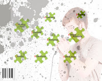 For the back cover I think I may follow the puzzle piece string idea I thought to do initially. I do like the use of the faded image and the paint splatters on the back of this album but I think it doesn’t look unique or different enough as a design so I need to develop this. I also need to use a different font, one which makes the text strike to attention much more as well as if I do include the puzzle pieces I may change the colour of these to fit in with the overall red and black colour scheme and make them more prominent because at the moment I think they blend in to the background.
 Magazine Advert- Currently I like the use of the image in the background and the grainy effect however I need to develop the puzzle piece design and make it a bit more unique. I’m considering including images of for example music notes in these puzzle pieces, if possible I want to make my design a bit more ambiguous because the purpose of a magazine advert is to introduce the album whilst not giving too much away and I feel mine in a way does. Additionally I want to improve the text featured on it because I think it’s quite plain and minimal once again.
Saturday 7 January 2012
Production diary
The past two weeks I’ve been focusing on creating my music video. I’ve been experimenting with various effects such as changing the speed duration on the video to reverse, for one of my clips the people featuring in the video pulled a party popper and I changed this into reverse and visually this looked quite good. Additionally I’ve been focusing on experimenting with the placement and order of the clips to see what arrangement they look best in. Also by watching the video through I’ve realised that some of shots aren’t paced enough so I’ve been working on correcting this and timing the shots more effectively with the pace of the song.
Additionally I've uploaded the audience feedback I got from my draft designs. This advice was particularly helpful in helping me to improve my designs and their overall concept, which will enable my final designs to be better.
The following are some screen shots of my music video making
  process:
Additionally I've uploaded the audience feedback I got from my draft designs. This advice was particularly helpful in helping me to improve my designs and their overall concept, which will enable my final designs to be better.
The following are some screen shots of my
 music video making
  process:
Friday 6 January 2012
Audience feedback on Digipack and album cover drafts:
I found the following audience feedback particularly helpful because it helped me to see where I had gone wrong on my initial designs and subsequently how I could improve on my final ones as well as allowing me to understand aspects of my drafts they liked so far, aspects I could work on and improve furthermore.
I asked 5 people to look at both of my designs, to suggest improvements and tell me what they liked so far. In terms of my digipack designs, the most useful feedback I got from a couple of people was to include something more on my first digipack because there was a lot of white space and it looked quite plain. Another thing was the text I had used and that I should consider using a bolder text, perhaps in a different colour because my designs in a way ‘out did’ the text meaning it didn’t stand out as much. For my album cover the feedback I received was similar, particularly because I’ve used a black and white grainy picture that I should focus on using a bolder, stronger text which would stand out more. It was also suggested I remove the puzzle piece directly on the main images face because it took away from the design, something I’m going to consider when creating my final drafts.
I asked 5 people to look at both of my designs, to suggest improvements and tell me what they liked so far. In terms of my digipack designs, the most useful feedback I got from a couple of people was to include something more on my first digipack because there was a lot of white space and it looked quite plain. Another thing was the text I had used and that I should consider using a bolder text, perhaps in a different colour because my designs in a way ‘out did’ the text meaning it didn’t stand out as much. For my album cover the feedback I received was similar, particularly because I’ve used a black and white grainy picture that I should focus on using a bolder, stronger text which would stand out more. It was also suggested I remove the puzzle piece directly on the main images face because it took away from the design, something I’m going to consider when creating my final drafts.
Subscribe to:
Posts (Atom)