These are the following improvements I want to make on my first drafts, based on the audience feedback I got:
 First album cover- I need to fill in the white spaces with maybe more puzzle pieces or another design, additionally I think the puzzle pieces are too small and need to be more noticeable as otherwise the whole effect can’t really be appreciated. I also want to make the overall picture a bit darker because I think at the moment it’s a bit too light and this draws away from the picture itself. I also need to change the font type and the background banner I’ve used, I want to use a bolder more striking text as well as one that looks a bit more professional and perhaps change the colour scheme from red and dark brown to bright red to black which will stand out more.
 First album cover- I need to fill in the white spaces with maybe more puzzle pieces or another design, additionally I think the puzzle pieces are too small and need to be more noticeable as otherwise the whole effect can’t really be appreciated. I also want to make the overall picture a bit darker because I think at the moment it’s a bit too light and this draws away from the picture itself. I also need to change the font type and the background banner I’ve used, I want to use a bolder more striking text as well as one that looks a bit more professional and perhaps change the colour scheme from red and dark brown to bright red to black which will stand out more.
 Second Album cover- Looking back at this now I really don’t like the overall design, I think it looks quite unprofessional and boring and therefore I want to completely change the design. I still want the new design however to be consistent with the overall puzzle piece scheme so I’m thinking of instead creating a digipack which includes various pictures of the artist such as long shots and close ups and these to be joined to one another as in a puzzle piece. I also need to work on finding or creating a bold striking text which I can use consistently throughout my designs in order to create a ‘house style’.
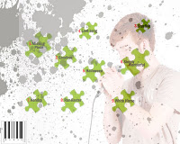 For the back cover I think I may follow the puzzle piece string idea I thought to do initially. I do like the use of the faded image and the paint splatters on the back of this album but I think it doesn’t look unique or different enough as a design so I need to develop this. I also need to use a different font, one which makes the text strike to attention much more as well as if I do include the puzzle pieces I may change the colour of these to fit in with the overall red and black colour scheme and make them more prominent because at the moment I think they blend in to the background.
 Magazine Advert- Currently I like the use of the image in the background and the grainy effect however I need to develop the puzzle piece design and make it a bit more unique. I’m considering including images of for example music notes in these puzzle pieces, if possible I want to make my design a bit more ambiguous because the purpose of a magazine advert is to introduce the album whilst not giving too much away and I feel mine in a way does. Additionally I want to improve the text featured on it because I think it’s quite plain and minimal once again.
No comments:
Post a Comment